Motion Capture II Reflection

My final thoughts on this semester’s experimental MoCap study, techniques I’ve learnt and issues I’ve dealt with upon completion of the project.

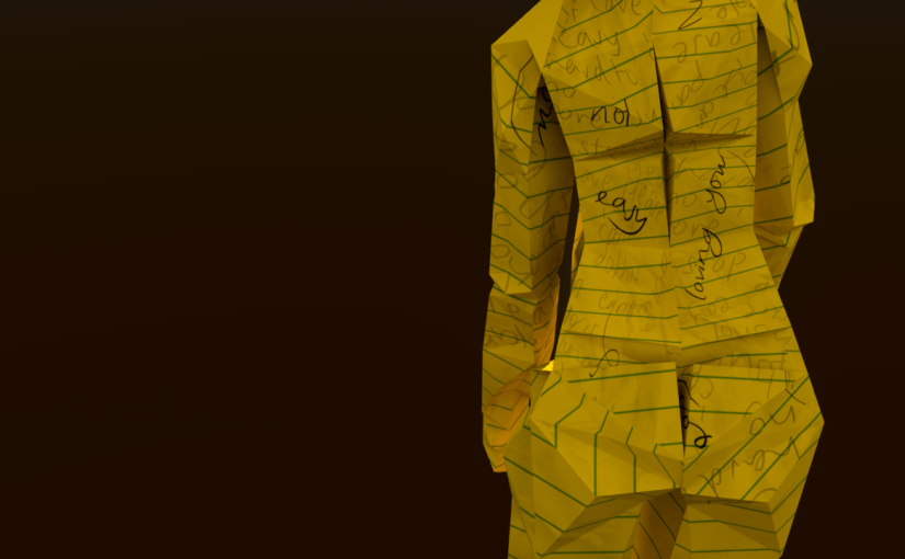
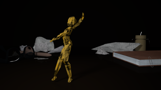
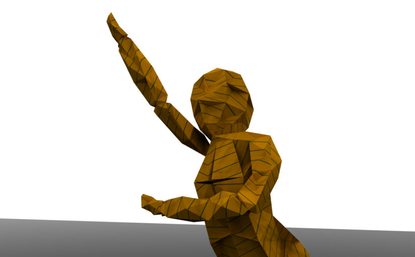
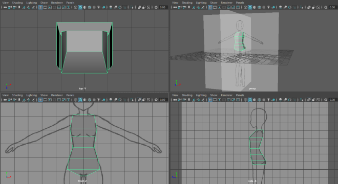
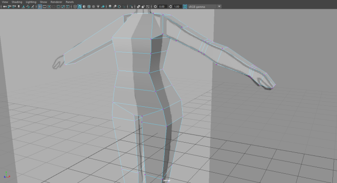
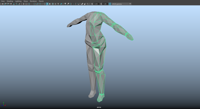
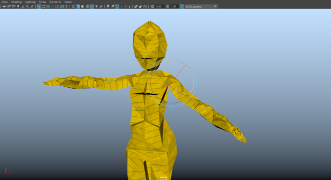
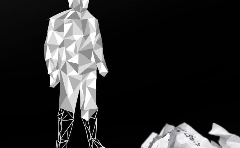
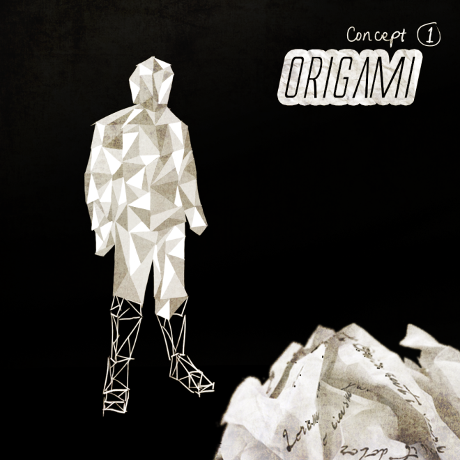
Character Modelling and Rigging. I’ve had numerous experiences with this process from past work, and it is always a breath of fresh air to find newer and more efficient ways to get them done. The Auto-Rig feature I discovered is definitely one of my highlights, and something I wish I knew in Year 1.

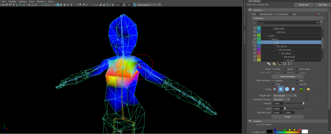
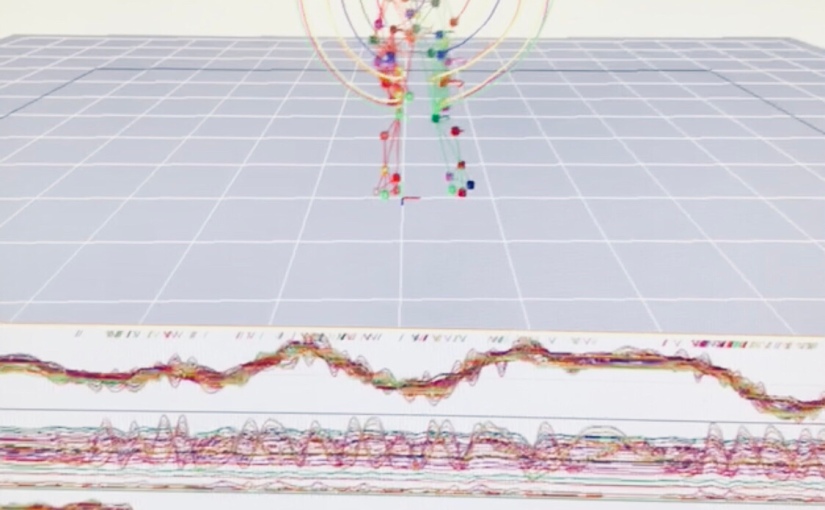
Data Clean-up. I found the clean-up process to be the second most frustrating this semester, but the sheer lack of glitches and errors in the base animation is what really paid off the effort I put into Cortex, and I will be keeping in mind the lessons learned in that stressful experience. I was fortunate enough to have finished everything before the suite got even more in demand and harder to book. That’s another note: allocating enough time to work on this especially crucial part of the project.

Motion Builder-Maya Pipeline. Apart from what I’ve already discussed about the failed rig prototypes, this is what I found the quickest and easiest to do. The tutorials provided are still pretty straightforward to follow and with them I didn’t come across any more obstacles with my character. This success of course points right back to how well the data is cleaned up and how relatively early I managed to finish it, giving me at least a week of head start to the rest of the tasks.

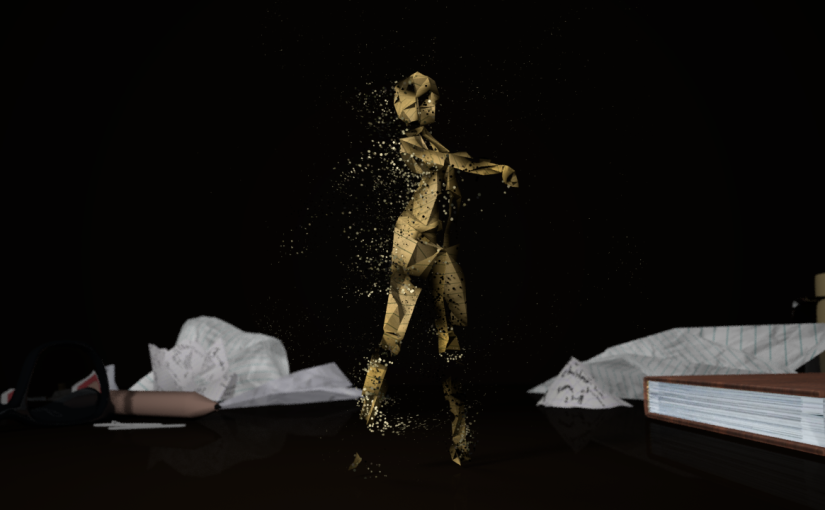
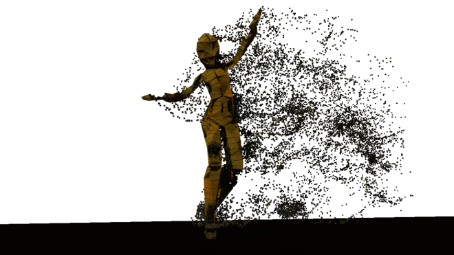
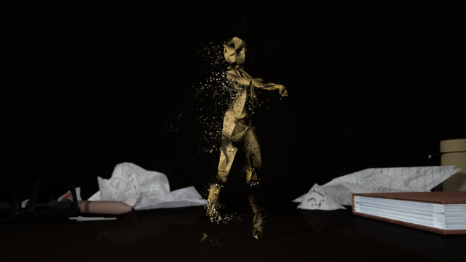
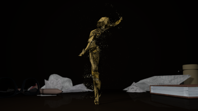
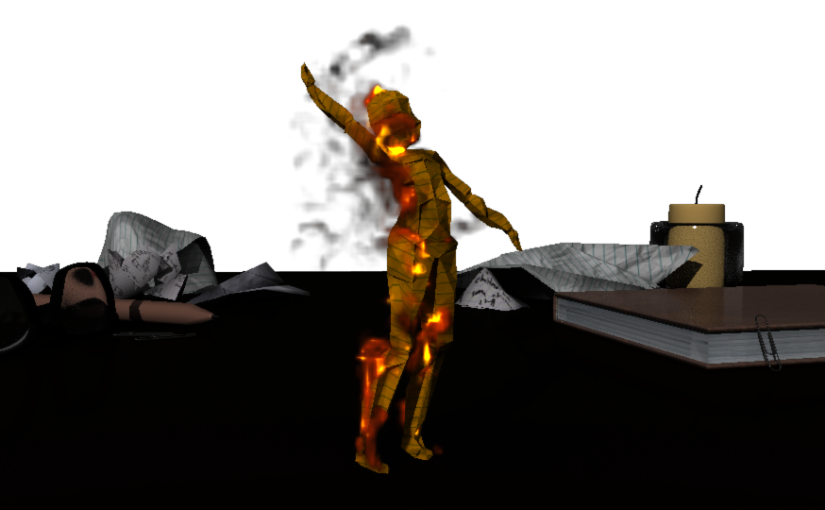
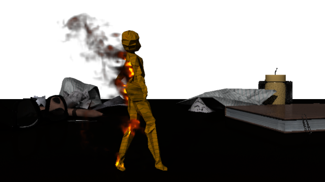
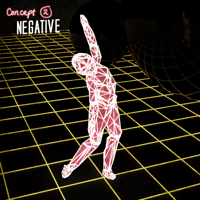
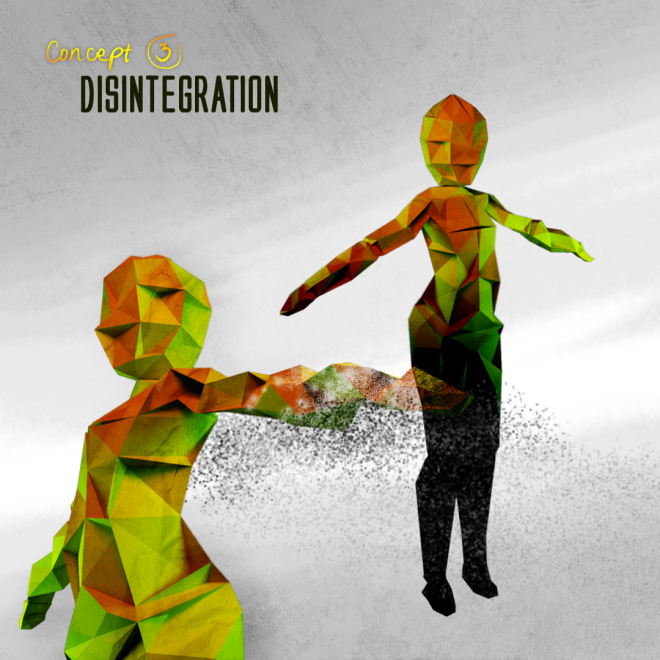
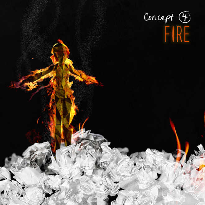
Maya FX Exploration. Since I had heaps of time to experiment, I went all out on all of my other concepts especially the fire and disintegration (ashes), and ended up using a combination of both for my final. I worked with playblasts of all my camera shots on Premiere Pro first to better visualise my sequence, and for the same reasons of allocating enough time to polish my work, knowing full well how time-consuming rendering would be. Which brings me to:

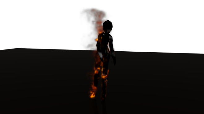
Rendering. It was fulfilling to have had my project carefully planned for once before I jumped into rendering my shots. Based on past experience, I struggled the most at the render stage due to relatively poor time management skills. But thanks to the existence of Redshift and the playbasted drafts of my sequence this time around, I was able to work out which frames were crucial to be rendered for certain camera shots, saving me the time, effort and regret had I rendered more than what was needed. The part I was most frustrated about was when I found out that Redshift was rejecting my fire simulation, and above all, when every solution I’ve ever looked up felt hopeless. The Green-screen idea was definitely a Eureka moment and hence my biggest highlight of the project process.

Video Polish (the fun part!). I thought my fire sim, due to it being rendered in Arnold and at low quality settings, looked pretty pixelated, and my attempt to optimise its appearance on After Effects via the Camera Blur and Glow effect, is what made all the difference. Editing has always been a forte, and I found compiling the shots for both my final and Work-In progress video enjoyable, as the feeling of having to rush through it was non-existent in this project. I compiled all of the shots on After Effects before sending my composition to Premiere Pro, where I added the necessary titles as well as a hint of maroon in the colour corrected adjustment layer to accentuate the fire and have it blend seamlessly with the backdrop.

Overall, I’m very happy looking back at how much I’ve learnt through this paper. I was paranoid to run out of time so I only rendered the final at 720p (though that’s the required ratio), and I might consider rendering out a 1080p version in the future, once I have better understanding of Redshift and able to work out the best settings for a higher quality render. Besides my OCD triggers, I am pleased with the outcomes and can say that it’s lived up to the vision I had in my head when I made its first conceptual art, and I still stand by my 10/10 rating and full recommendation on Redshift, without which I would not have pulled through.

Rendering: Redshift vs Arnold

In this post I will be weighing in on the pros and cons of each renderer, and which one I found to be the most efficient to use for this project.

One of the standard renderers for Maya is Arnold, and I’m relatively more familiar with it as I’ve used it on a lot of my Year 1 work, so it’s pretty much second nature to do my render tests there. While it makes very clean shots (as shown in the above comparison), it uses your computer’s CPU threads when rendering, averaging about 4 minutes per frame to finish off a well-lit scene, especially one with a lot of refractions. When it came to my work, due to it involving Fire FX and nParticles (with about 8 lighting samples to avoid noise), it took almost a quarter of an hour to render one frame, an amount of time I did not want to risk (because my sequence consisted of 998 frames in total, meaning it will take days.)

Redshift, on the other hand, uses GPU rendering and hence is comparatively 50x faster than Arnold. The feedback of the progressive render tests are almost instantaneous, which proves helpful when tweaking little details in the Maya scene. It includes many options such as Vignette, Fog and even generating Bokeh in areas that aren’t in the camera’s focal distance. While it requires you to change all of your Arnold shaders to their Redshift counterparts, the switch isn’t too time consuming. The shots also look almost identical to Arnold, granted I’ve added Motion Blur to it as well without having to wait an extra minute.

The only downside despite its faster render time, is that, since Redshift is fairly new, it doesn’t currently support Maya fluids (the feature I used to do my fire in). I went to research any possible work-arounds on this issue, and got to a point where I’ve installed an OpenVDB plug-in that supposedly converts the fluids into renderable Redshift meshes, only to find out that it does not actually work with the version of Redshift I have. The only option I had was to render the fire through Arnold (and as I’ve mentioned before, this would take approximately 37 hours.)

To save time, I decided to render the rest of my scene on Redshift (which took a little over an hour in total), while the fire is being done on Arnold (in a separate computer). I switched the mesh’s texture to an aiFlat surface, which was coloured green. This was to act as an alpha channel which I can then overlay on top of the Redshift sequence on After Effects. The reason why I didn’t just render the fire by itself was so I didn’t have to mask out parts of the fire that are not meant to be seen from the camera angle. Green-screen alpha channel was the perfect solution.

I tested this idea out on some frames on After Effects (removing the green using the Keylight feature) before carrying on with the batch render:

vlcsnap-2018-06-15-22h42m19s141

The results are instantly magical, and I found my new life hack.

Incorporating Ash using nParticles

In this exploration, I learned new techniques on how to control particle emissions, again through the use of alpha textures. I followed another YouTube tutorial for helpful advice and reference.

(1) Base Texture, (2) Alpha Channel, (3) Emission Map

Just like what I did with the fire FX, also following the formats of white = emissions and black = transparency, I imported PNG sequences I produced from After Effects to set the texture animation. I’ve unticked the Opaque feature before setting the 2nd sequence above as an alpha channel, so that parts of the mesh appear transparent in the render, and at the same time bear the illusion of paper burning out.

WSburnt.0773

Just from looking at the emission map, you may notice its differences from the fire emission map in the previous post, as that was quite literally just the inverted version of this texture’s alpha channel. What the white outline represents is the particle emissions, and it is laid out in a way so that the transparent parts of the mesh don’t actually emit ash, rather the areas that surround them do, giving more of a sensible outcome.


mocaprender12

I wasn’t quite happy with my first render of the ash, mainly due to the particle shaders having the same colour, and it removes the illusion of depth. So I played around further with the settings and eventually found something called particle size/colour “Age” feature, which lets you adjust the respective appearances of the particles based on how long they’ve been emitted. This made comparatively better results I was a lot more satisfied with:

redshiftash.0869cuablur.0837

(Rendered from Redshift.)

Now that this was settled, it is time to figure out which renderer to use on which shots. Consistency should be present and so as much as possible I would want to stick to just one, however I also need to consider the amount of time it’s going to take to finish rendering, and ensure I have just enough time to polish everything before the project due date. For that I will end this entry on a high note by saying I’m happy with the current results I have, and will be outlining the said dilemma in a different post.

Playing with Maya’s Fire Simulation FX

Once I was happy with my model, it was time to incorporate my fire concept. I did some research beforehand and found this YouTube tutorial video specifically helpful as it not only outlines the use of Maya fluids when simulating fire, but also touches on how to control emissions via alpha maps. As opposed to any ordinary simulation affecting the entire geometry, I only wanted certain parts of my character mesh to emit fire. To achieve this, I hopped on Photoshop to create the following textures:

(1) Original Texture, (2) Burnt Texture, (3) Fire Emission map

Going through the tutorial, the alpha channels shown on the 3rd texture are the ones I used to control fire emissions from the mesh (black = no emissions, white = emissions). For the sake of efficiency and to avoid messing up my original character mesh, an Alembic cache is referenced. What this does is it maintains the objects’ hierarchy and saves as essentially a duplicate geometry of my character, in which I can make all of my fluid emissions changes instead.

mocaprender6

I had a little play-around with the settings of the emission, still following the YouTube tutorial, until the result looked the most like fire as shown above. (Rendered with Arnold.)

mocaprender8

Then I hid the alembic cache to reveal my original character geometry, and also began animating the texture, fading (1) to (2), to give off the sense of burning paper. This was achieved via linking Image Sequences of the texture animation (which I exported as .PNG files from After Effects) to the materials.

Despite how good everything started to look, the render time was considerably slower on Arnold due to this effect (it was slow trying to load the simulation in the viewport to begin with), and so I’m considering learning Redshift (a GPU-based renderer) which I heard is supposedly a lot faster than the former. I’ll get back to this blog once I’ve done that.

Lighting Exploration through my VFX Assignment

This is an 80s inspired MTV Ident I made for my Studio III paper. I happened to incorporate the model I initially intended to use solely for my minor as one of the many retro elements I’ve put together for this assignment, and I thought it worked seamlessly.

Due to this prototype testing and the experiments I made with regards to neon lighting, the exploration helped me decide on the mood for my MoCap sequence. I now intend to do the polar opposite of what this video portrays as a way to bring contrasting ideas to life; meaning while this ident is light-hearted and well-lit, my Origami short will feel more melancholic in essence.

Origami Mesh Progression

After much consideration, I decided to just craft a mesh that entirely mimics the look of an Origami as opposed to my initial idea of combining a wireframe / toon outlines look with it, as this will prove distracting and inconsistent with the mood I wanted to go for: that being a melancholic sequence that becomes a visual metaphor for ‘love and death’ (mainly the death aspect). As I go through with the 3D model, I will be integrating screenshots to my process for more clarity.

forwordpress1

The early process involved importing reference images as planes onto the Orthographic front and side views of the Maya viewport, solely for modelling guidelines. I then began to mold the character from a primitive cube, adding new edge loops and adjusting the vertices to follow the shape of the reference image accordingly.

forwordpress2forwordpress3

I began by first shaping the torso before making my way out to the arms and legs (extruded from the top and bottom sides). An efficient method in ensuring the mesh is symmetrical, (saving me the efforts of having to work on one side of the body at a time) is Maya’s Duplicate Special, a feature that essentially mirrors half of your mesh with instant feedbacks.

By the time the model started to look more like a body, I wanted to give my character a more polygonal look to create the folds in the paper, so what I did was subdivided the faces of the mesh into triangles (as shown in the screenshot above). With these new vertices I am able to shape the model in a way that makes it look a lot less blocky.

I also added lights in the scene so I could tell which areas needed more emphasis. This is the result:

forwordpress4forwordpress5

The same process is applied to the head. As opposed to the cube, I used a primitive sphere to make the shaping a little easier. I connected the head to the body once I was happy with the outcome, deleted the Duplicate Special and mirrored the 1/2 before combining them into one whole mesh.

forwordpress6

The next step was rigging a skeleton for the model, followed by Weight Painting or assigning which parts of the mesh goes with which joint in the skeleton. At first I went through a similar process as my 3D game character last year – a brief overview of that can be found in this post. While this rigging method worked for a moment, further testing later had me struggling to create a fully functional control rig that is compatible with my capture data (as well as the MotionBuilder actor I would later use to retarget it with). Somehow the effectors I’ve assigned on the joints weren’t doing their job. With little patience to figure out how let alone what to fix, I ended up using the Auto-Rig feature on Maya instead, which I found to be relatively more efficient and just as customiseable as the rig I made previously.

Auto-Rig gave me the option of manually setting up the guides in positioning the joints. They were also properly labelled, making it easier to tell where to place them in my character’s anatomy. As soon as I finished this step, the control rig (with detailed control references visible in the outliner) was made in just one click. The Weight Painting was close to perfect, I had to readjust a few minor deformation errors, but I did find this to be more effortless compared to when I made the rig from scratch.

forwordpress7

After this, I was finally able to test this new rig out on my capture data in MotionBuilder without experiencing further issues, which was a huge sigh of relief.

I then followed the Motion Capture Pipeline tutorials provided to the class, to retarget my data until it’s moving well with the mesh, later baking it and adding extra animation layers to manually refine the movement, especially in areas not affected by MoCap such as that of the foot and the wrist. I used the video we recorded at our session as reference for this task. (see Capture session post)

Since I’ll be adding more FX, I fixed the textures and UVs last without baking them into the mesh just to keep my options wide in terms of the final look:

Final Character mesh

Textured look (Arnold Render)

The reason for the yellow pad-paper texture (made in Photoshop) was not only to mimic the look of an origami but also to emphasise the paper folds through the refill lines; I found it hard to make them noticeable with just a plain colour. For the extra detail I also added the following scribbles:

mocapCUfire.0106

The words “loving you, not easy” echoes the lyrics of the song I intend to use in the sequence. (The free track, Reaching the Summit VIP Remix – Andy Leech & Justin Jet Zorbas, with permission to use and modify for educational purposes)

Ambience composition

mocaprender3mocaprender5

Other than filling up the empty backdrop of my scene to make it aesthetically pleasing, I wanted to give a sense of familiarity in the environment, having it resemble a student’s desk, but not so much to a point where the focus is taken away from the Origami character. (Note: assets in the back are free and downloaded from TurboSquid.)

Data Clean-up in Cortex

I was most confident about this bit of the MoCap process, because based on the data we acquired last year, it was relatively a quick and easy one. However I seem to have run into more issues with marker switches this year that were harder to spot, which slowed things down for me.

The first factor was that Cortex Suites were very high in demand. Perhaps I underestimated how time consuming it was going to be as I only booked the room for 2 hours. It turns out I needed more than that which led me to booking for another day with a longer session. Thankfully, I was able to spot the initially unnoticeable glitches in the data I thought was cleaned up before I called it a day.

The issue was that I focused more on closing the gaps in the data (usually caused by the marker switches) and assuming they were ‘fixed’ before actually checking whether the closure fit the rest of the motion. Sometimes the cubic joint / virtual joint tools leave jagged lines, causing the marker to fly off and thus disrupt the motion flow. And so what I did was I restarted the process and became much more careful (instead of closing the gaps with one click, I went through them frame by frame to ensure no jagged lines were created.)

Here is a video of the cleaned up data, without glitches. (The motion flows are noticeably smoother and curved, and I was good to go.)

Conceptual Art Developments and Alternatives

Part of my design process involves crafting different ideations and alternatives on Photoshop for a clearer visualisation of the final project, and the further exploration on the mood of the sequence that I’ll eventually go for. Images below are my final four conceptual art.

mocapconcept1

As mentioned in my previous post, this is a quick 2D sketch I made and it will serve as a guide to the later modelling of my Origami character concept in 3D.

mocapconcept2

For the sake of exploration and quick experiments on geometry, I made a version of my initial Origami mesh with toon outlines I generated on Maya, which is then rendered to resemble neon lights, further accentuating the wireframe look. (I used this concept for my MTV Ident Assignment, here is the link to that video.)

mocapconcept3mocapconcept4

Both these concepts are what I’m considering to develop towards my final project, I am thinking on making perhaps a combination of the two, such as that of the use of ash to transition between the fire and the disappearance (death) of the character.